


Up to 350,000 customers visit our online store every month. They are fans with a vast array of hobbies – from board gamers, fantasy readers, RPG players, and PC gamers to fans of movies, series, tea, unconventional travel, and a natural lifestyle.
For years, we felt that the name "fantasyobchod" (fantasy shop) kept its gates slightly closed, letting in only the chosen ones – geeks, nerds, and die-hard fans. But our world is for all open minds – for all unconventional hobbies, strange pastimes, and things you wear or don't wear. And so we created imago – a space for everything your imagination allows.
How did we choose the name?
It was a long process. First, we thought long and hard about who we are and how our customers and fans see us. We thought about what we want to show people and what we want to give them. We made a plan and together we put together three hundred proposals.
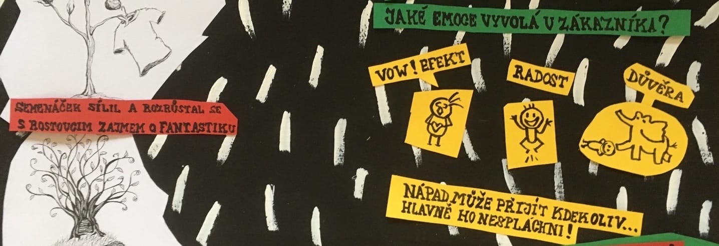
In the end, we didn't choose a single one ☹️. Further brainstorming then took place among our fans. We received hundreds more suggestions, and one of them inspired us. A small anagram was all it took, and imago was born!
What is imago? For us, imago is fantasy; we liked the Latin origin of the word (image, hence imagination). We also liked the reference to the work of author Robert Holdstock. Basically, we didn't want the name to be too explicit – we wanted a blank space that we could fill ourselves.
Why and how did we change the logo?
To be honest, we had a lot of trouble with the old logo. It was big, clunky, and hard to work with. We wanted more freedom, more elegance, more practical use, and above all, the eye and hand of a real graphic designer to design it for us. We deliberately abandoned traditional fantasy symbolism – dragons, swords, runes… We wanted the most versatile symbol possible, one that would look good on a post-apo poster, on the planet Arrakis, next to a Star Wars logo, with The Witcher, or with Frodo's ring.
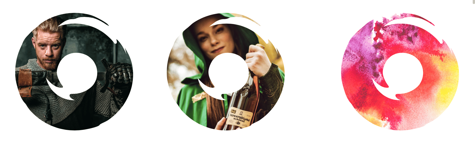
We had strict criteria for the new logo, some of which were slightly contradictory. Martin Gottwald, who created the logo for us, really broke a sweat over it. The result was hundreds of partial designs.
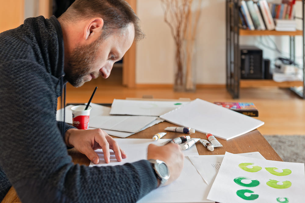
In short, we wanted our logo to refer to our old self, to have something natural about it, to be a bit hand-made, to be as simple as possible, and to be usable in many places and in many ways…
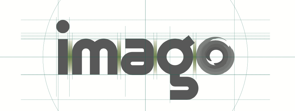
The font of our logo is based on a font aptly named Spock 🖖. The complementary colors are shades of green – we embraced green many years ago, and as a natural color, it accompanies us and will continue to do so.
We have plenty of other plans for the future, and the transformation into imago is just the first step toward realizing them. Thanks for being on this journey with us! ❤️